K-nearest neighbors (KNN) is a simple nonparametric method for both regression and classification. In a linear model, we estimate a coefficient vector and predict at a target using . KNN instead estimates the function value directly from nearby observations. For regression, it averages their responses.
Suppose we observe , where contains predictors. The KNN estimate at a target is
where contains the closest training observations. We start with ordinary Euclidean distance. Here, counts the coordinates used to measure distance; we do not add an intercept column.
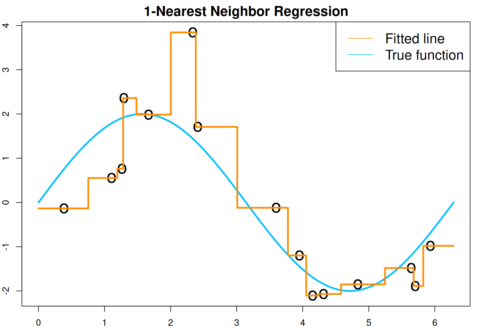
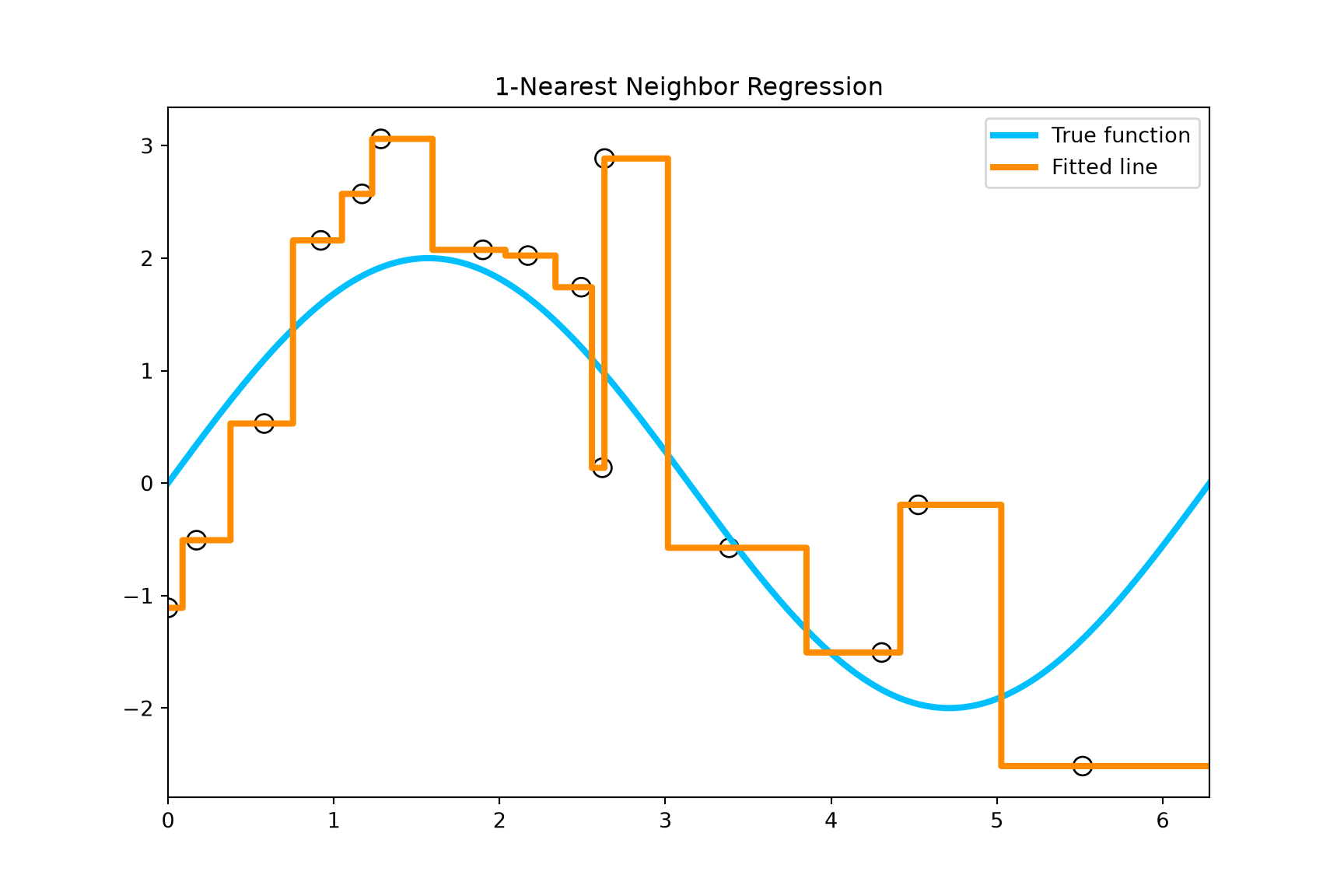
The following one-predictor example uses with independent normal errors of variance one. With , the prediction at each location is the response of its nearest training observation. The object test.x is a grid of evaluation locations; we have not yet generated test outcomes there.
The R and Python simulations use the same model and settings. Their random draws differ because the languages use different random-number generators. Run the code blocks in your chosen language in order.
# generate training data with 2*sin(x) and random Gaussian errorsset.seed(1) x <-runif(15, 0, 2*pi) y <-2*sin(x) +rnorm(length(x))# generate testing data points where we evaluate the prediction function test.x =seq(0, 1, 0.001)*2*pi# "1-nearest neighbor" regression using kknn packagelibrary(kknn) knn.fit =kknn(y ~ ., train =data.frame(x = x, y = y),test =data.frame(x = test.x),k =1, kernel ="rectangular") test.pred = knn.fit$fitted.values# plot the datapar(mar=rep(2,4))plot(x, y, xlim =c(0, 2*pi), pch ="o", cex =2,xlab ="", ylab ="", cex.lab =1.5)title(main="1-Nearest Neighbor Regression", cex.main =1.5)# plot the true regression linelines(test.x, 2*sin(test.x), col ="deepskyblue", lwd =3)# plot the fitted linelines(test.x, test.pred, type ="s", col ="darkorange", lwd =3)legend("topright", c("Fitted line", "True function"),col =c("darkorange", "deepskyblue"), lty =1, cex =1.5)
Show the reproducible code
import numpy as npimport matplotlib.pyplot as pltfrom sklearn.neighbors import KNeighborsRegressor# Generate training data with 2*sin(x) and random Gaussian errors.np.random.seed(1)x = np.random.uniform(0, 2* np.pi, 15)y =2* np.sin(x) + np.random.normal(size=len(x))# Generate the locations where we evaluate the prediction function.test_x = np.linspace(0, 2* np.pi, 1001)knn_fit = KNeighborsRegressor(n_neighbors=1, weights="uniform")knn_fit.fit(x.reshape(-1, 1), y)test_pred = knn_fit.predict(test_x.reshape(-1, 1))plt.figure(figsize=(9, 6))plt.scatter(x, y, facecolors="none", edgecolors="black", s=80)plt.plot(test_x, 2* np.sin(test_x), color="deepskyblue", linewidth=3, label="True function")plt.step(test_x, test_pred, where="post", color="darkorange", linewidth=3, label="Fitted line")plt.xlim(0, 2* np.pi)plt.title("1-Nearest Neighbor Regression")plt.legend(loc="upper right")plt.show()
Tuning
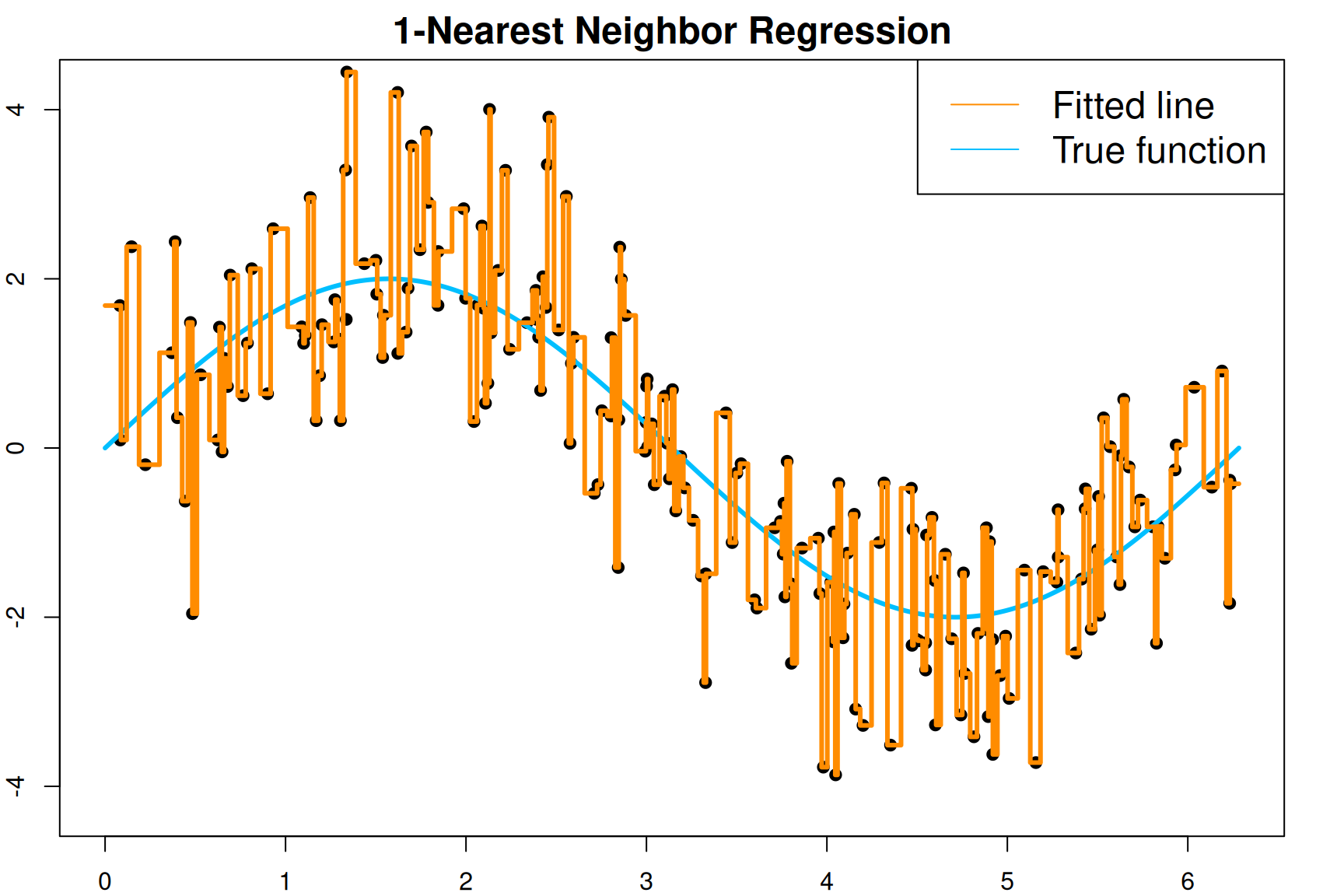
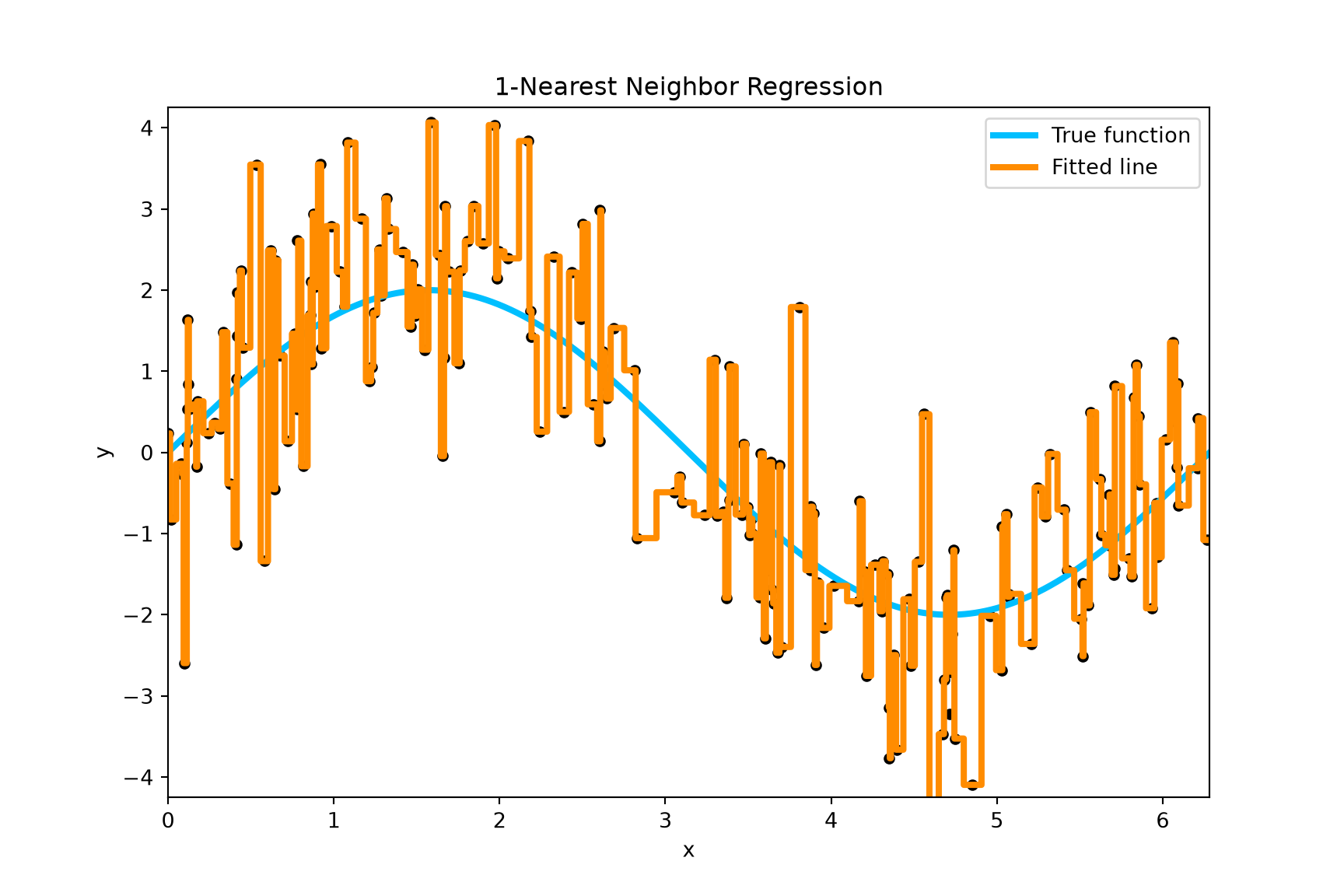
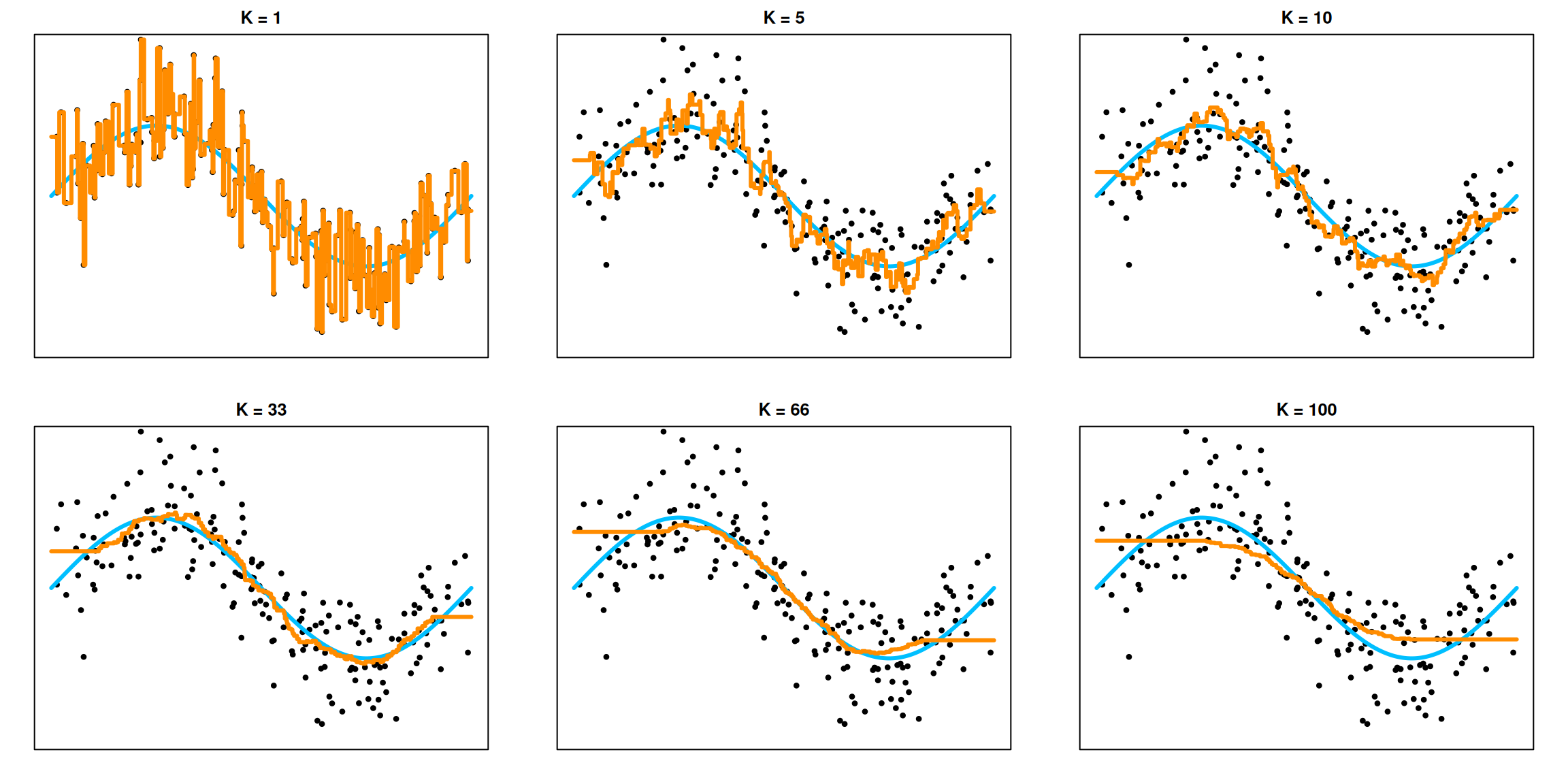
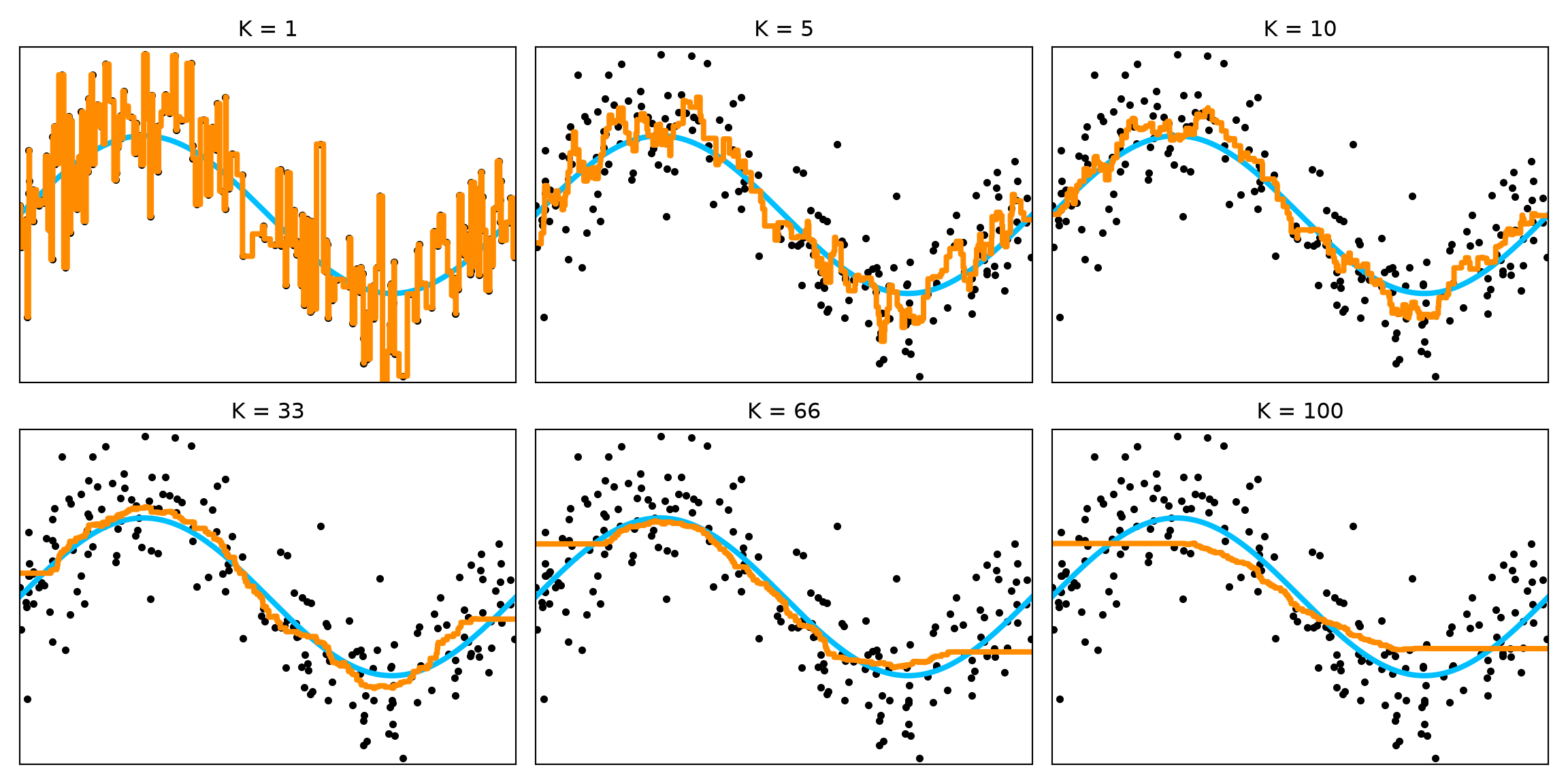
The number of neighbors controls how local the average is. Let us generate 200 observations from the same sine model. Even with more data, the 1NN fitted line is very jumpy because each prediction uses just one noisy response.
We now generate independent test outcomes, test.y, at the grid locations. The training data and test outcomes will stay the same as we compare different values of .
Next, compare . Each panel uses the same training observations and the same blue true function. The printed errors compare predictions with the same realized test outcomes. They are not expectations over repeated datasets.
Prediction Error for K = 1 : 2.1632998751292227
Prediction Error for K = 5 : 1.216483355797572
Prediction Error for K = 10 : 1.102826116995153
Prediction Error for K = 33 : 1.0291066603340622
Prediction Error for K = 66 : 1.170161289432704
Prediction Error for K = 100 : 1.3013185135794527
Show the reproducible code
plt.tight_layout()plt.show()
Larger neighborhoods average more noise, making the fitted function more stable. They also reach farther from the target, which can hide local features of the sine curve. Smaller neighborhoods retain those features but are more sensitive to the noise. This is the bias-variance trade-off. Because we are using these errors to compare choices of , they serve a tuning role here. We will return to cross-validation below.
The bias-variance trade-off
At a fixed target , let be a new response, with mean-zero noise independent of the training data and variance . To connect directly to the neighbor average, hold the training covariates fixed and take expectations over the training responses and the new response.
Add and subtract and :
The cross terms have expectation zero: the new noise is independent of the fitted value and has mean zero, and the centered fitted value also has mean zero.
In the sine example, the irreducible error is one. With fixed training covariates and independent training errors of variance one, the variance of an average of neighbor responses is .
When , that variance is one. With 200 observations and a smooth true function, the nearest point is usually close enough that its mean response is close to . The squared bias is then small, so the expected prediction error is close to . An observed test error need not equal two.
When , every prediction is the overall response average. Its variance is , but its bias is the difference between the average of the training-point means and . This can be large where the sine curve is far from that overall average.
Typically, increasing reduces variance while increasing bias from averaging over a wider region. Decreasing has the opposite effect. The bias need not change monotonically at every target, and one observed error curve need not form a perfect U.
KNN for classification
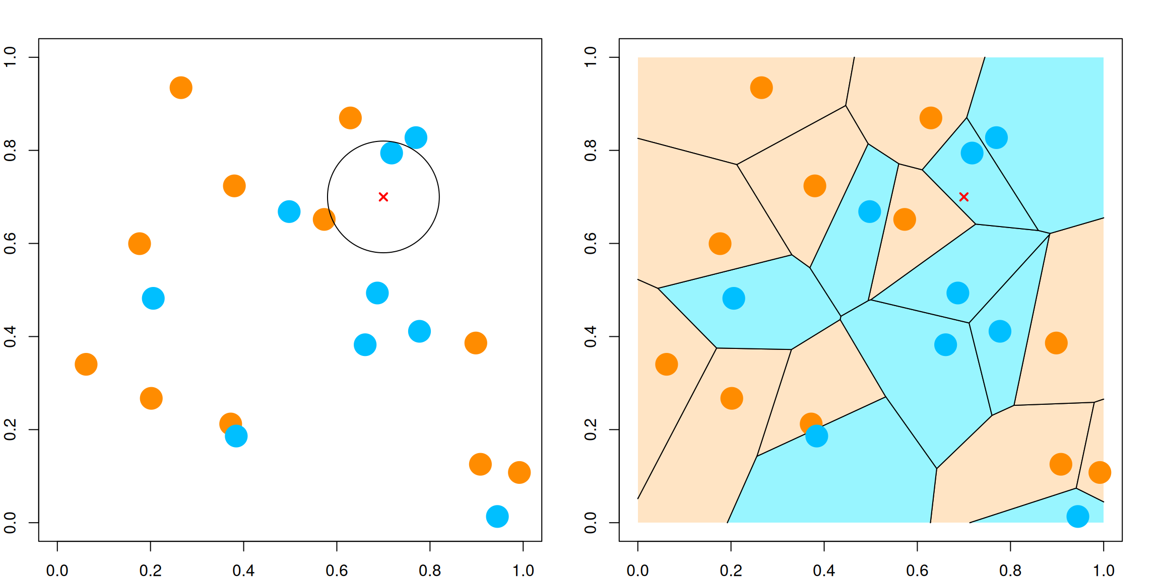
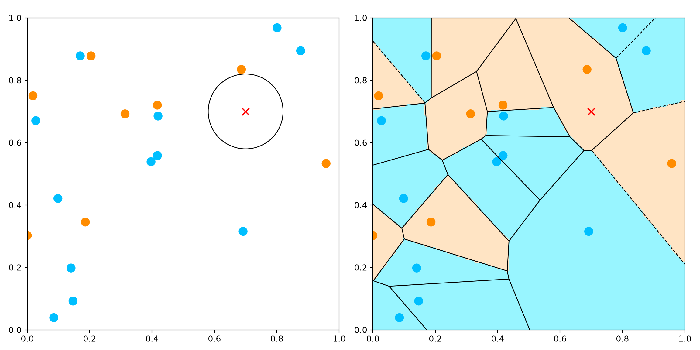
Classification uses the same neighbor search as regression. The difference is how we combine the neighbors’ responses: we take a majority vote, choosing the most common class label, instead of averaging numerical responses. For 1NN, the prediction is simply the class of the closest observation.
The left panel shows 20 random observations in with binary labels. The red cross marks the target . The right panel shows a Voronoi tessellation: every location in a cell has the same closest training observation and therefore the same 1NN prediction. The circle in the left panel marks a neighborhood around the target for illustration; the rule itself selects the nearest observation.
# knn for classification:library(class)par(mfrow=c(1,2))par(mar=rep(2,4))# generate 20 random observations, with random class 1/0set.seed(1) x <-matrix(runif(40), 20, 2) g <-rbinom(20, 1, 0.5)# plot the dataplot(x, col=ifelse(g==1, "darkorange", "deepskyblue"), pch =19,cex =3, xlim=c(0, 1), ylim =c(0, 1))symbols(0.7, 0.7, circles =0.12, add =TRUE, inches =FALSE)points(0.7, 0.7, pch =4, lwd =2, col ="red")# generate a grid for plot xgd1 = xgd2 =seq(0, 1, 0.01) gd =expand.grid(xgd1, xgd2)# fit a 1-nearest neighbor model and get the fitted class knn1 <-knn(x, gd, g, k=1) knn1.class <-matrix(knn1, length(xgd1), length(xgd2))# Voronoi tessalation plot (1NN)library(deldir) z <-deldir(x =data.frame(x = x[,1], y = x[,2], z=as.factor(g)),rw =c(0, 1, 0, 1)) w <-tile.list(z)plot(w, fillcol=ifelse(g==1, "bisque", "cadetblue1"))points(x, col=ifelse(g==1, "darkorange", "deepskyblue"), pch =19, cex =3)points(0.7, 0.7, pch =4, lwd =2, col ="red")
Show the reproducible code
from sklearn.neighbors import KNeighborsClassifierfrom scipy.spatial import Voronoi, voronoi_plot_2dfrom matplotlib.colors import ListedColormapfrom matplotlib.patches import Circle# Generate 20 random observations, with random class 1/0.np.random.seed(1)x = np.random.uniform(size=(20, 2))g = np.random.binomial(1, 0.5, size=20)fig, axes = plt.subplots(1, 2, figsize=(12, 6))axes[0].scatter(x[:, 0], x[:, 1], c=np.where(g ==1, "darkorange", "deepskyblue"), s=100)axes[0].add_patch(Circle((0.7, 0.7), 0.12, fill=False))axes[0].scatter(0.7, 0.7, marker="x", color="red", s=80)# Generate a grid and predict the class using one nearest neighbor.xgd1 = xgd2 = np.linspace(0, 1, 101)gd1, gd2 = np.meshgrid(xgd1, xgd2)gd = np.column_stack((gd1.ravel(), gd2.ravel()))knn1 = KNeighborsClassifier(n_neighbors=1, weights="uniform")knn1.fit(x, g)knn1_class = knn1.predict(gd).reshape(gd1.shape)# Fill the predicted regions and draw the Voronoi cell boundaries.axes[1].contourf(gd1, gd2, knn1_class, levels=[-0.5, 0.5, 1.5], cmap=ListedColormap(["#98f5ff", "bisque"]))voronoi_plot_2d(Voronoi(x), ax=axes[1], show_points=False, show_vertices=False, line_colors="black", line_width=1)axes[1].scatter(x[:, 0], x[:, 1], c=np.where(g ==1, "darkorange", "deepskyblue"), s=100)axes[1].scatter(0.7, 0.7, marker="x", color="red", s=80)for ax in axes: ax.set_xlim(0, 1) ax.set_ylim(0, 1) ax.set_aspect("equal")plt.tight_layout()plt.show()
Example: Artificial data
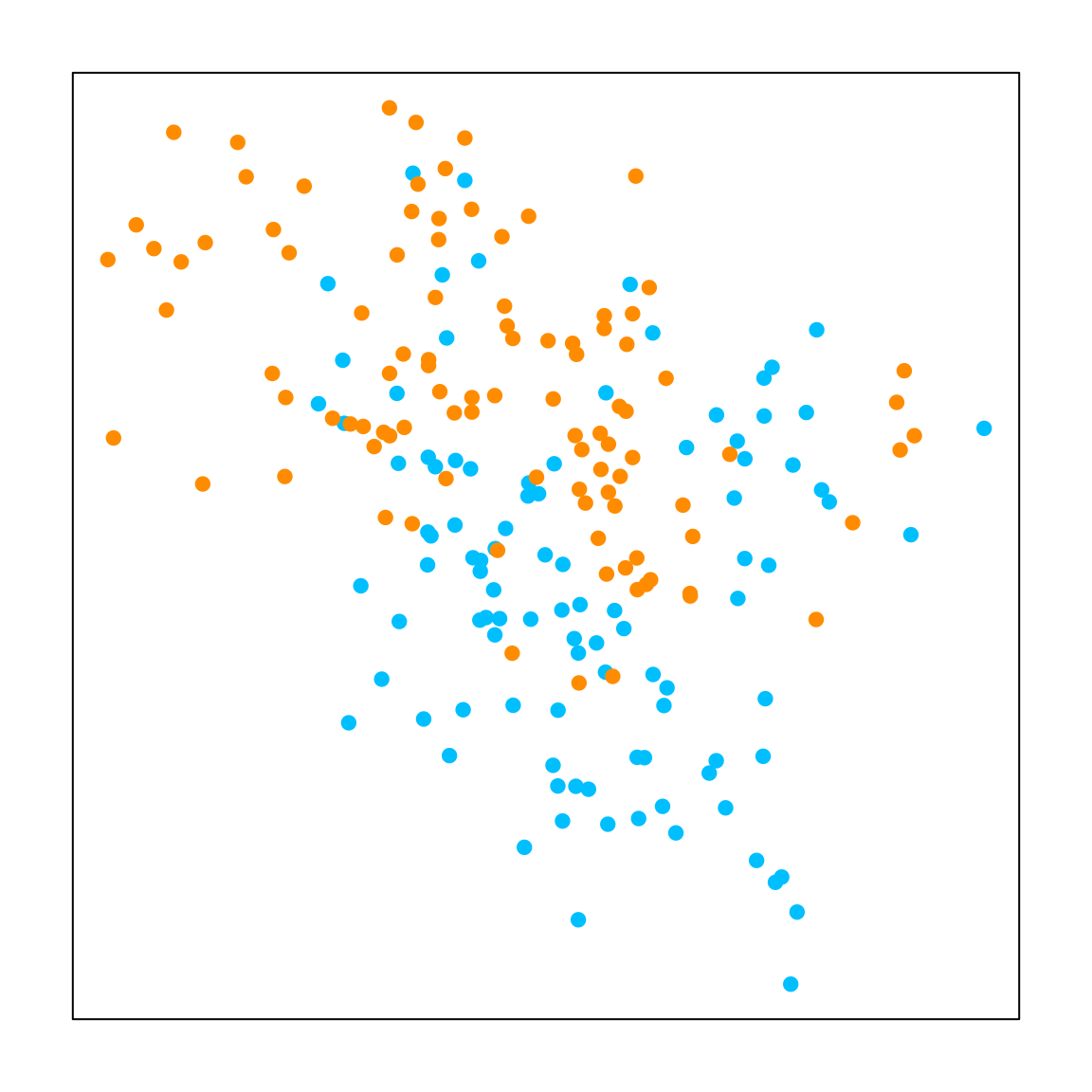
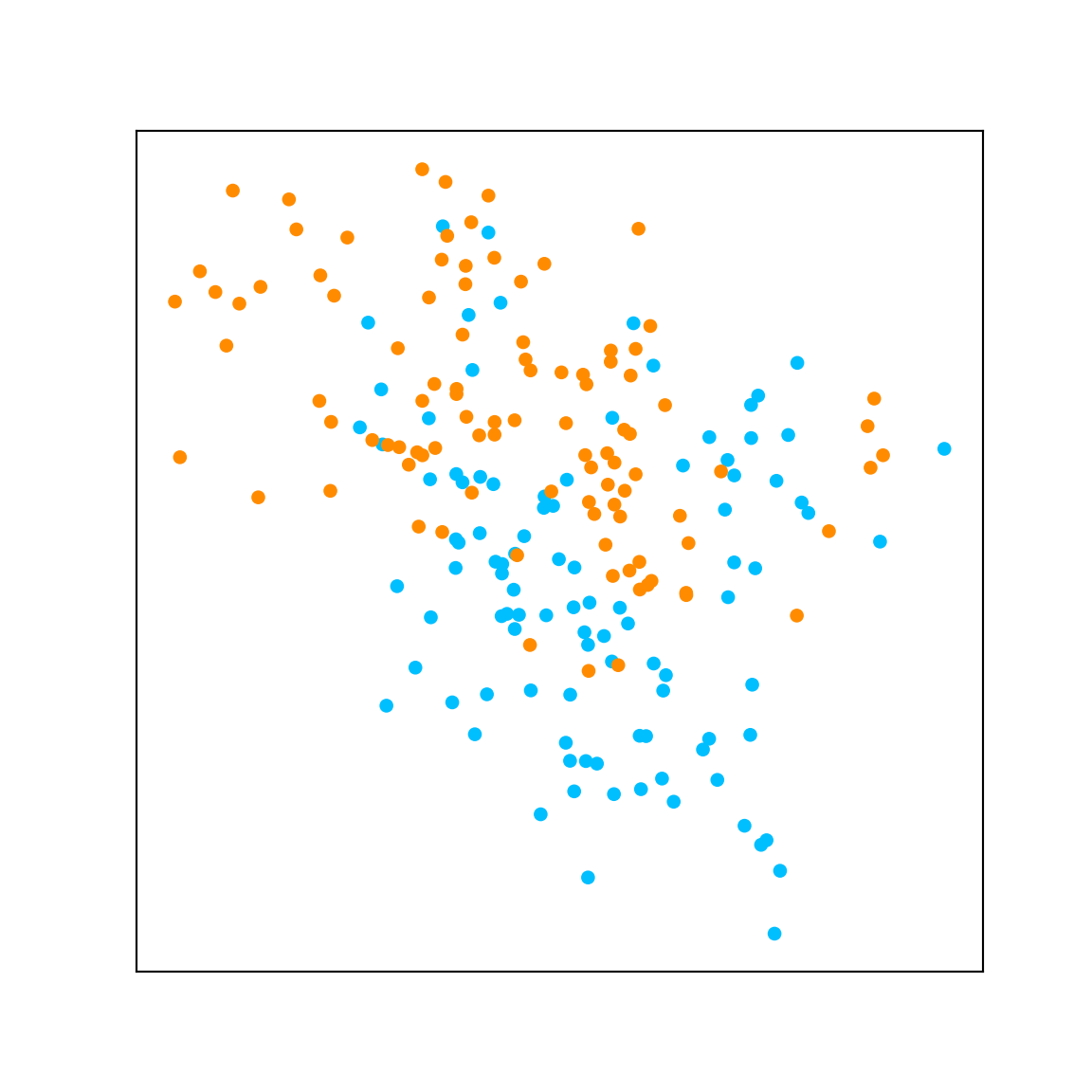
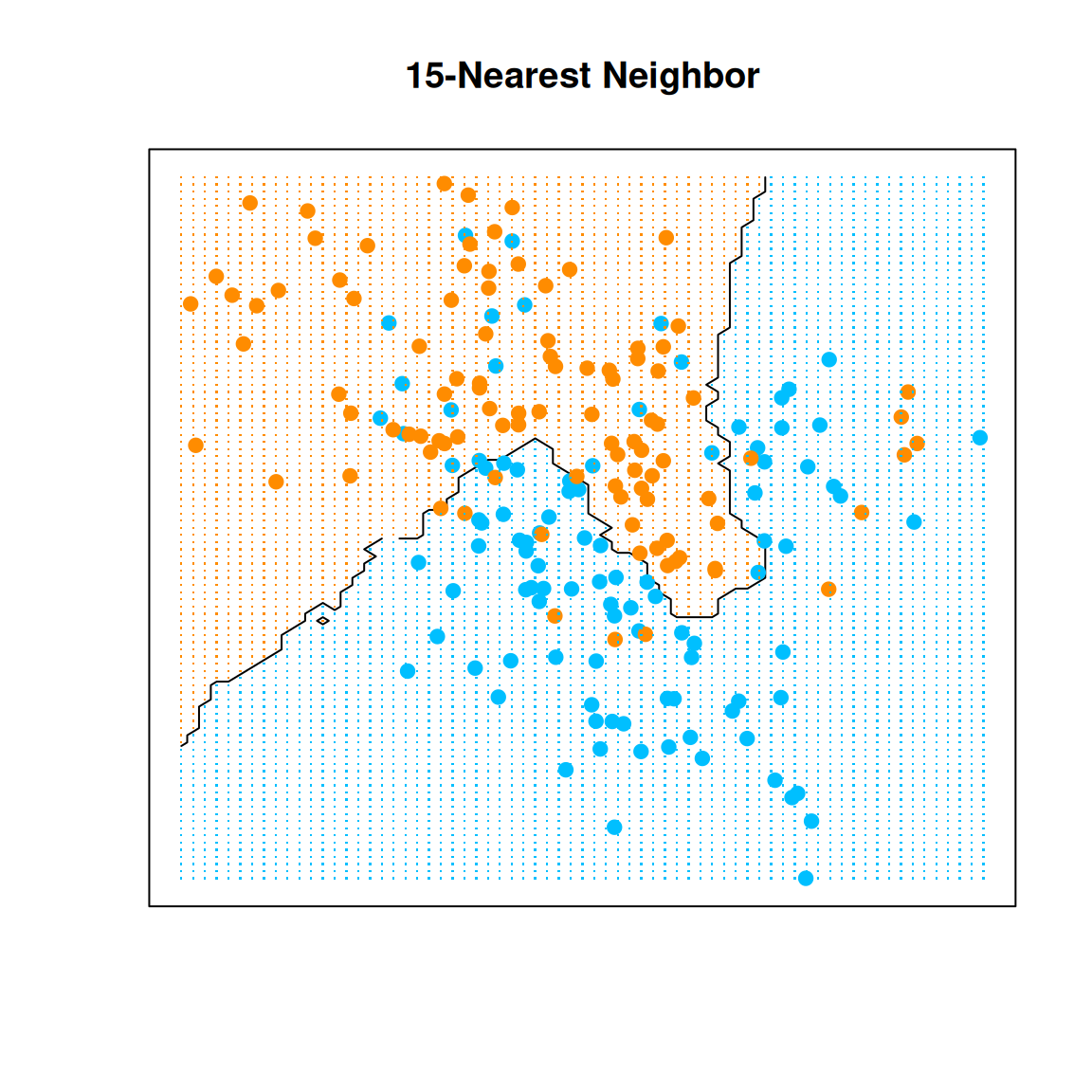
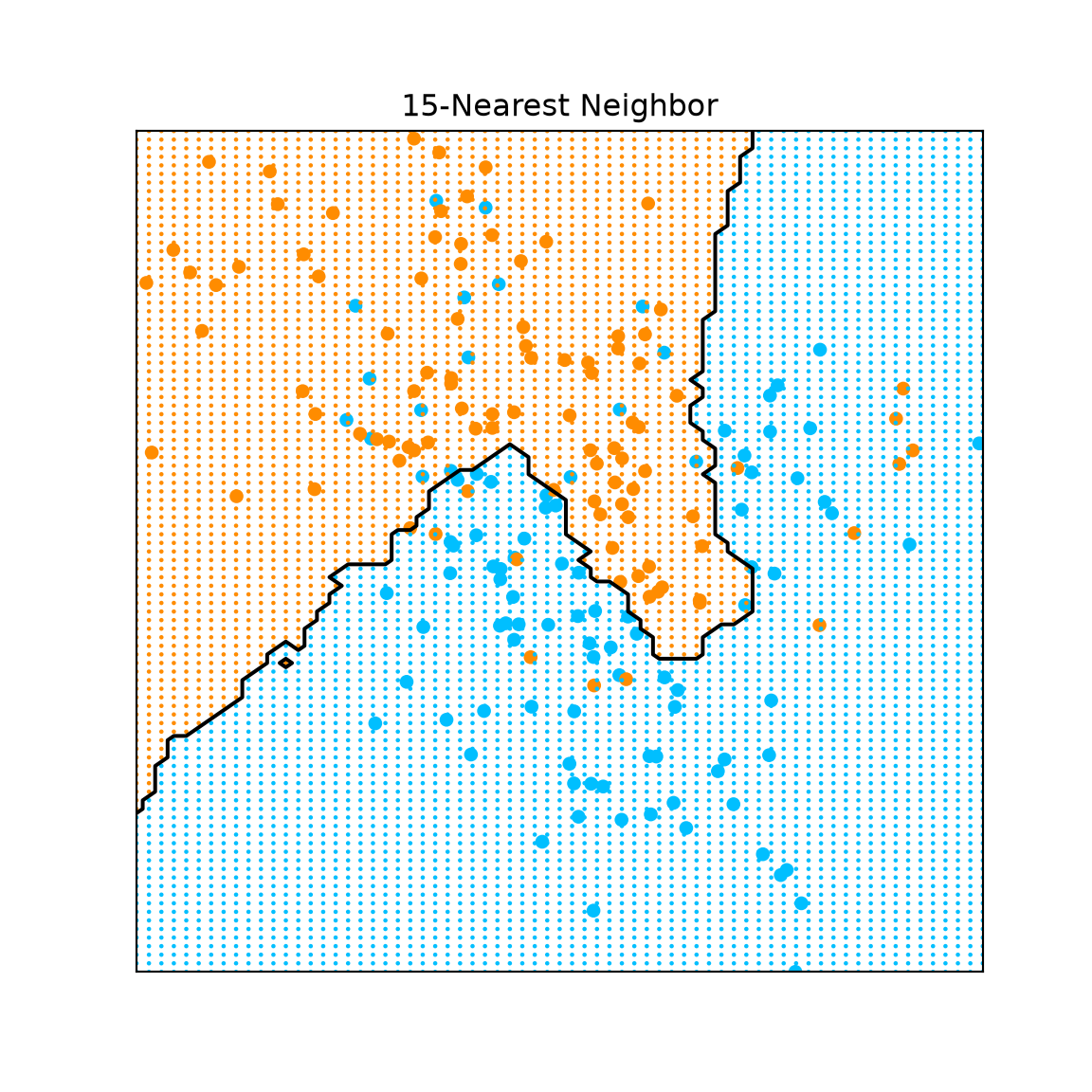
We now use mixture.example from the ElemStatLearn package. Its two classes have overlapping distributions, so a straight boundary may not capture their pattern well.
For Python, the supplied training data and prediction grid are exact exports of the same dataset. Save them in data/knn/ and run the code from the folder containing data/. The grid contains locations for displaying predictions, not additional labeled observations.
We can summarize the in-sample predictions with a confusion matrix. Rows are predicted classes and columns are observed classes. These observations were also used to fit the rule, so this matrix measures training performance, not test performance.
As in Week 3, cross-validation lets us choose a tuning parameter using held-out observations within the available training data. In R, caret specifies the resampling rule with trainControl(). The Python counterpart uses StratifiedKFold for the same ten-fold classification procedure.
library(caret) control <-trainControl(method ="cv", number =10)
Show the reproducible code
from sklearn.model_selection import StratifiedKFold, GridSearchCVcontrol = StratifiedKFold(n_splits=10, shuffle=True, random_state=1)
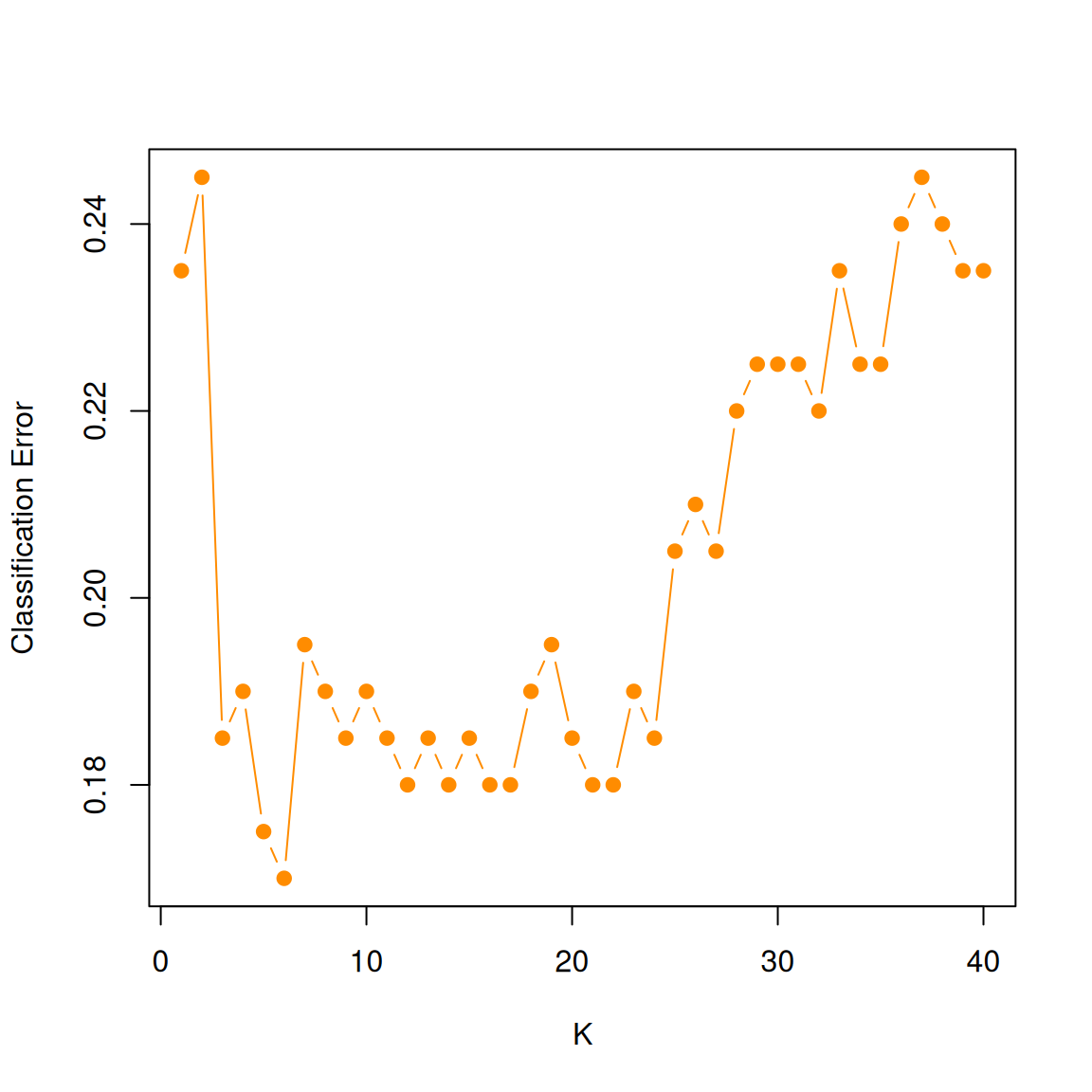
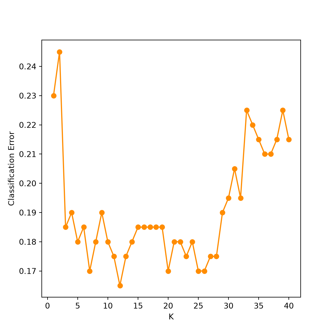
Other choices include repeated cross-validation (repeatedcv in caret) and leave-one-out cross-validation (LOOCV). See ?trainControl for the R options. Here we keep ten folds and compare every from 1 through 40. In R, method="knn" selects the model and a factor-valued outcome tells caret to perform classification.
The selected value minimizes the average validation classification error. The curve helps us see the effect of , but it need not be a smooth U. The folds and tie-breaking conventions can differ between packages, so the two languages need not select exactly the same .
Distance measures
Until now, closeness has meant Euclidean distance. Its square is
Taking the square root gives Euclidean distance; both versions order the neighbors the same way. The measure depends on units: a variable with a large numerical scale can dominate. A standardized version is
where is the variance of predictor . We can estimate it from the training data. When using cross-validation, estimate these scales within each training fold, just as we did for ridge regression.
The Mahalanobis distance also accounts for correlations:
where is the covariance matrix, assumed invertible, and can be estimated using the sample covariance matrix.
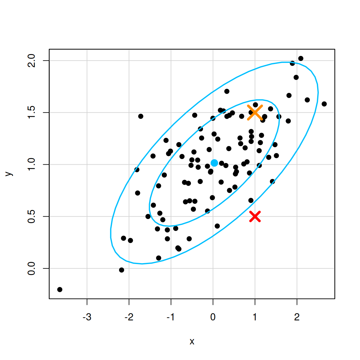
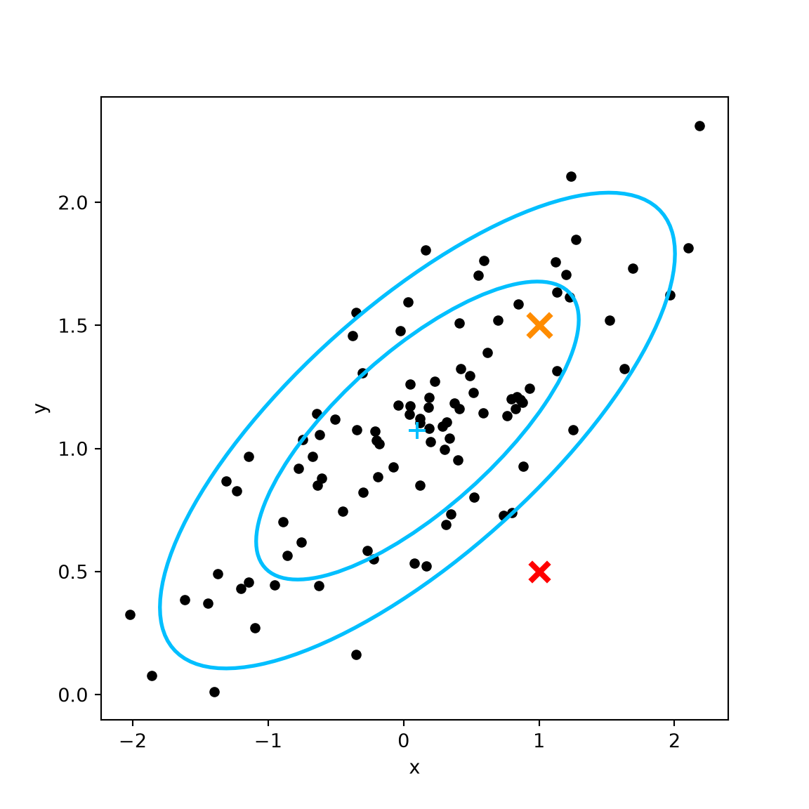
In the following example, the population center is . The red cross at and orange cross at have the same Euclidean distance from that center. But the red point is farther from the pattern of the joint distribution. Mahalanobis distance reflects that distinction. The ellipses use the realized sample mean and covariance, so their center need not be exactly .
x=rnorm(100) y=1+0.3*x +0.3*rnorm(100)library(car)dataEllipse(x, y, levels=c(0.6, 0.9), col =c("black", "deepskyblue"), pch =19)points(1, 0.5, col ="red", pch =4, cex =2, lwd =4)points(1, 1.5, col ="darkorange", pch =4, cex =3, lwd =4)
Show the reproducible code
from matplotlib.patches import Ellipsefrom scipy.stats import fx = np.random.normal(size=100)y =1+0.3* x +0.3* np.random.normal(size=100)# Sample mean and covariance define the data ellipses.center = [np.mean(x), np.mean(y)]values, vectors = np.linalg.eigh(np.cov(x, y))angle = np.degrees(np.arctan2(vectors[1, 1], vectors[0, 1]))fig, ax = plt.subplots(figsize=(6, 6))ax.scatter(x, y, color="black", s=20)ax.scatter(*center, color="deepskyblue", marker="+", s=80)for level in [0.6, 0.9]: radius = np.sqrt(2* f.ppf(level, 2, len(x) -1)) ax.add_patch(Ellipse(center, width=2* radius * np.sqrt(values[1]), height=2* radius * np.sqrt(values[0]), angle=angle, fill=False, edgecolor="deepskyblue", linewidth=2))ax.scatter(1, 0.5, color="red", marker="x", s=100, linewidths=3)ax.scatter(1, 1.5, color="darkorange", marker="x", s=150, linewidths=3)ax.set_xlabel("x")ax.set_ylabel("y")plt.show()
For categorical variables, Hamming distance counts the coordinates with different values:
Computational issues
A direct nearest-neighbor search calculates and compares distances to the training observations. This can be expensive when the training sample is large. We also need to retain the training data for future predictions. In a fitted linear model, by comparison, prediction uses the estimated coefficient vector.
More efficient neighbor-search algorithms are available. The R package FNN provides such implementations; we will use it in the companion note.
Different KNN functions
Check whether a function performs regression or classification before using it. In these demonstrations, kknn performs regression with equal neighbor weights because we specified kernel="rectangular". The function class::knn performs classification, and caret::train provides the cross-validation interface. The companion uses FNN::knn.reg for regression. In R, ??knn helps locate the available functions.
Python provides KNeighborsRegressor and KNeighborsClassifier for the two tasks; GridSearchCV chooses by cross-validation. In both languages, keep track of whether the output is a numerical mean estimate or a class label.
 R
R Python