A fitted logistic regression gives an estimated probability for each observation. A practitioner still needs to decide which probabilities are high enough to call positive. Lowering that cutoff finds more positive cases, but also creates more false positives. We will use a confusion matrix to count these consequences and an ROC curve to display the trade-off over all cutoffs.
Learning goals
By the end of this lecture, you should be able to:
obtain estimated probabilities from a fitted logistic regression;
turn those probabilities into decisions at a chosen cutoff;
construct a confusion matrix and calculate sensitivity and specificity;
explain what changes when the cutoff moves; and
plot an ROC curve and interpret its AUC.
Start with estimated probabilities
As in the previous lecture, let and let be its fitted estimate. Class 1 is the positive class. The cutoff gives the decision
For example, an estimated probability of gives class 0 at cutoff and class 1 at cutoff . The estimated probability has not changed. The decision has.
Guiding question. As we lower the cutoff, how many more positive cases do we find, and how many negative cases do we incorrectly call positive?
Fit a logistic regression
We use the same simulated two-predictor dataset throughout this lecture. It contains 600 training observations and 600 independent test observations. Both languages read the same supplied file and use its existing split. Download the classification data or run the code from the course repository root.
Logistic regression models the log odds as a linear function of the predictors. For our two predictors,
After fitting the coefficients, the estimated probability is
This transformation keeps the prediction between zero and one. We fit the coefficients by minimizing training log loss, introduced in the previous lecture. We use ordinary logistic regression with an intercept and no penalty. The package handles the numerical fitting so that we can concentrate on evaluating the predictions.
Run the blocks in your chosen language in order. In R, type = "response" requests probabilities. In Python, predict_proba returns one column per class; the column indexed by 1 gives the probability of class 1 for our labels 0 and 1.
data <-read.csv("data/week-06/classification.csv")train <-subset(data, split =="train")test <-subset(data, split =="test")fit <-glm(y ~ x1 + x2, data = train, family =binomial())p_hat <-predict(fit, newdata = test, type ="response")y <- test$yround(coef(fit), 3)
(Intercept)          x1          x2
     -1.306       1.080      -0.376
Show the reproducible code
import numpy as npimport pandas as pdimport matplotlib.pyplot as pltfrom sklearn.linear_model import LogisticRegressiondata = pd.read_csv("data/week-06/classification.csv")train = data.loc[data["split"] =="train"]test = data.loc[data["split"] =="test"]# Infinite C removes the coefficient penalty.fit = LogisticRegression(C=np.inf, solver="lbfgs", tol=1e-10, max_iter=1000)fit.fit(train[["x1", "x2"]], train["y"])p_hat = fit.predict_proba(test[["x1", "x2"]])[:, 1]y = test["y"].to_numpy()print(np.round(np.r_[fit.intercept_, fit.coef_[0]], 3))
[-1.306 1.08 -0.376]
The fitted coefficients are approximately , , and . Thus, holding fixed, a larger gives a larger fitted probability. At , the fitted probability is approximately .
In the previous lecture, changing the training sample changed the fitted probabilities. Here, the fitted coefficients and all 600 test probabilities stay fixed. We change only the cutoff, which changes the decisions made from those probabilities.
Count decisions with a confusion matrix
A confusion matrix compares predicted classes with observed classes. Here, rows are observed classes and columns are predicted classes.1
Predict 0
Predict 1
Observed 0
True negative (TN)
False positive (FP)
Observed 1
False negative (FN)
True positive (TP)
A false positive is an observed class-0 case that we call positive. A false negative is an observed class-1 case that we miss. Adding FP and FN gives the number of mistakes counted by the previous lecture’s - loss. Start with cutoff :
There are 425 observed negatives and 175 observed positives. At cutoff , the fitted rule correctly calls 407 of the negatives and 54 of the positives. It makes 18 false-positive and 121 false-negative decisions.
Sensitivity and specificity
Sensitivity measures how often we detect an observed positive. Specificity measures how often we correctly reject an observed negative:
The denominators are different. Sensitivity uses only actual positives; specificity uses only actual negatives. Sensitivity is also called the true-positive rate. The false-positive rate is
Keep this complement in mind: the ROC curve below will use the false-positive rate on its horizontal axis and sensitivity on its vertical axis.
For our cutoff of ,
The rule correctly rejects most negative cases, but detects fewer than one-third of the positive cases. Reporting these two rates makes that trade-off visible.
Move the cutoff
Lower the cutoff from to . Observations with fitted probabilities between and now change from predicted class 0 to predicted class 1. No observation moves in the other direction.
Consequently, lowering the cutoff can only increase or leave unchanged the true-positive count and the false-positive count. Sensitivity rises or stays the same, while specificity falls or stays the same.
Compare three cutoffs
Use , , and . These are illustrative choices, not cutoffs selected by optimizing test performance. The following code calculates the four counts directly from the decisions.
At cutoff , sensitivity rises to and specificity falls to . Compared with , we detect 43 additional positive cases and incorrectly call 46 additional negative cases positive.
At cutoff , sensitivity rises further to , while specificity falls to . The lower cutoff finds more positives at the cost of more false alarms.
See which probabilities cross the cutoff
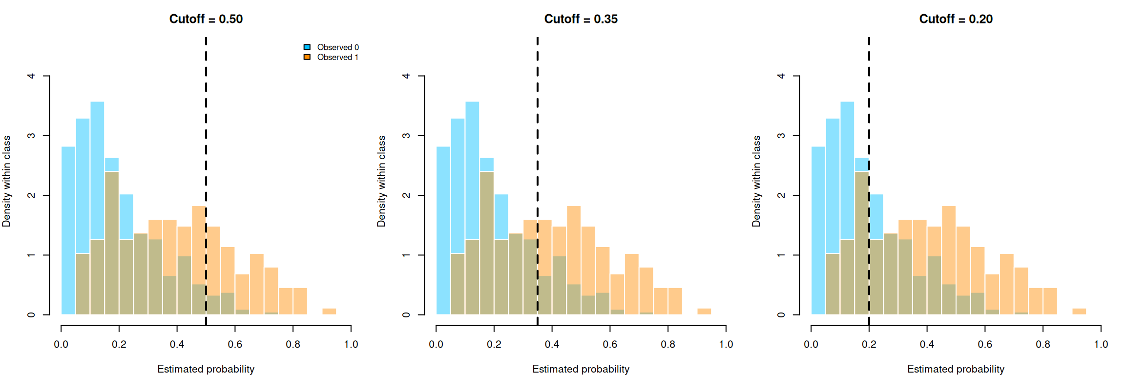
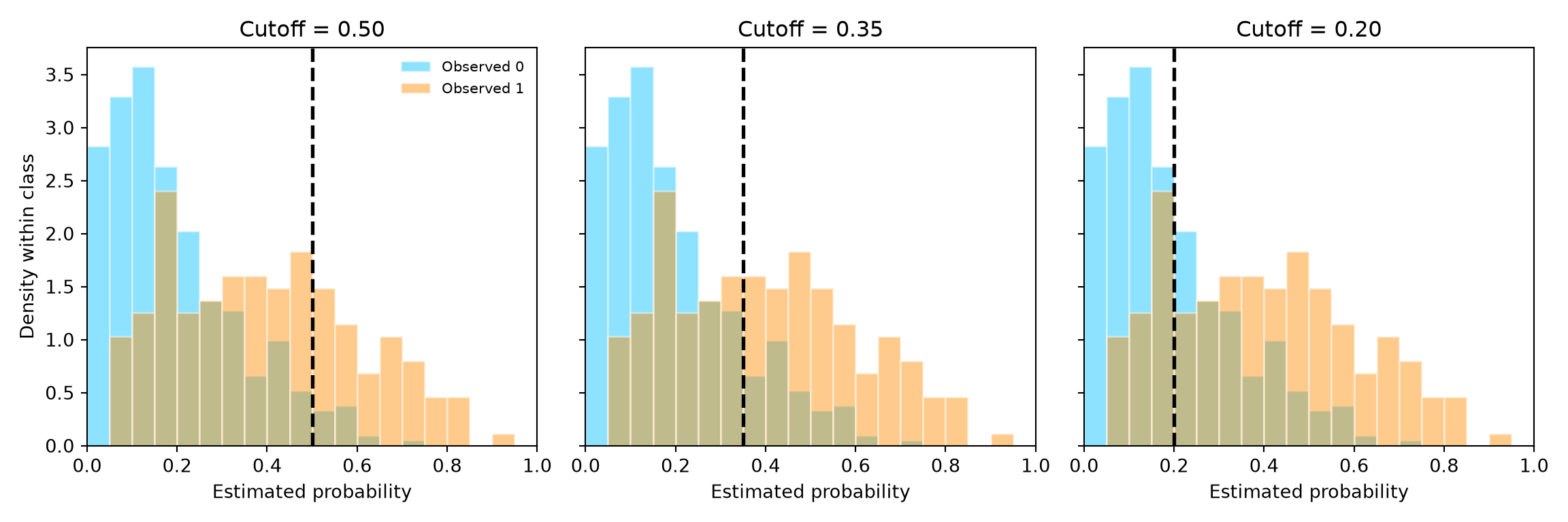
The next panels show the fitted probabilities separately for the two observed classes. The distributions are identical in all three panels. Only the vertical cutoff moves. For the observed positives, probabilities to the right of the cutoff are true positives. For the observed negatives, probabilities to the right are false positives.
The same logistic probabilities at three cutoffs. Values at or above the dashed line are classified as positive.
Each class histogram has total area one, so we can compare the distributions even though there are more negatives than positives. As the cutoff moves left, the fraction of the orange distribution to its right grows, increasing sensitivity. The fraction of the blue distribution to its left shrinks, decreasing specificity. The confusion matrices above give the exact counts.
From moving cutoffs to an ROC curve
The receiver operating characteristic (ROC) curve extends our three-cutoff comparison to every cutoff. Each confusion matrix supplies a sensitivity and a false-positive rate, which become the coordinates of one point. Its axes are
Each cutoff gives one point. To construct the curve:
Start above the largest fitted probability. No observation is called positive, so both rates are zero.
Lower the cutoff through the fitted probabilities. Each newly included positive increases the true-positive rate; each newly included negative increases the false-positive rate.
Finish at or below the smallest fitted probability. Everyone is called positive, so both rates are one.
The curve therefore runs from to as the cutoff decreases. A useful model moves upward quickly while accumulating relatively few false positives. The upper-left corner represents sensitivity one and specificity one.
Plot the ROC curve
In R, the loop below applies the same counting calculation at every distinct fitted probability. In Python, roc_curve performs that calculation directly. Both use the estimated probabilities as their input, rather than the class labels from a single cutoff.2
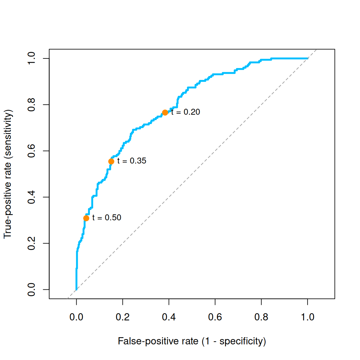
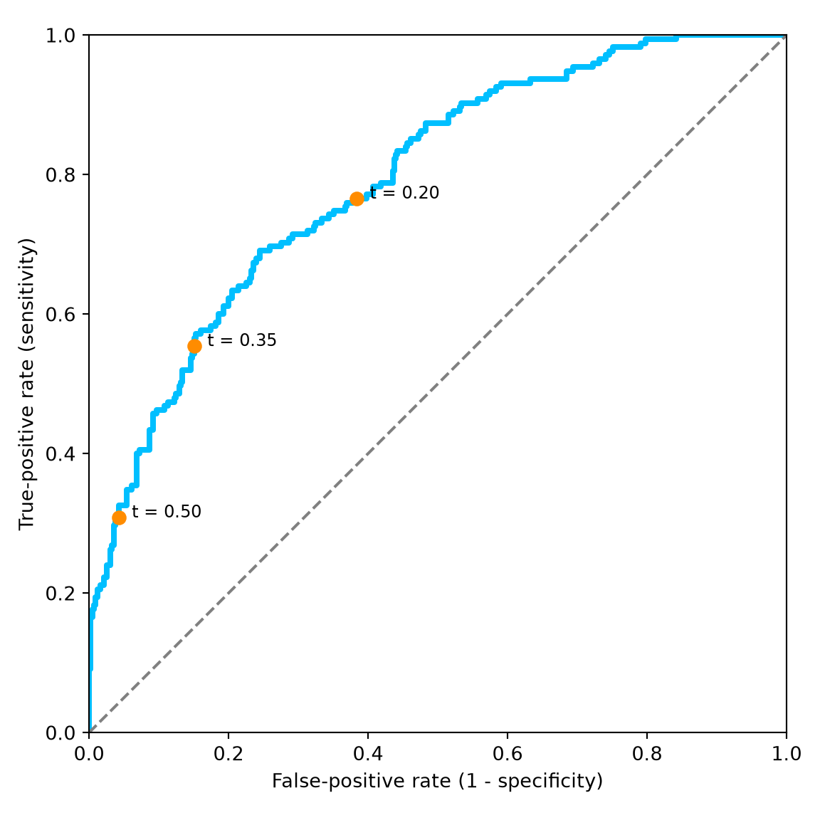
ROC curve for the fixed logistic regression on 600 test observations. The marked points use the same three cutoffs as the confusion matrices.
The point for has a low false-positive rate but also low sensitivity. Moving to and then moves the point upward and to the right. This is exactly the trade-off in the confusion matrices, displayed on common axes.
The diagonal describes a rule that selects the same fraction of each class, as random selection would on average. A curve above it indicates useful ranking: positive cases tend to receive larger fitted probabilities than negative cases.
Summarize the curve with AUC
The area under the ROC curve, or AUC, summarizes how well the fitted probabilities rank the two classes. It ranges from zero to one:
AUC means every positive case is ranked above every negative case.
AUC is the benchmark for scores that do not distinguish the classes.
AUC below indicates ranking that favors negatives over positives on the evaluated sample.
Compute the area with trapezoids in R or roc_auc_score in Python:
from sklearn.metrics import roc_auc_scoreauc = roc_auc_score(y, p_hat)print(round(auc, 3))
0.791
The test AUC is approximately . Equivalently, if we choose one positive and one negative from this test sample, the positive has the larger fitted probability about 79.1 percent of the time, counting ties as half a success.
AUC does not mean that 79.1 percent of class decisions are correct. Class decisions require a cutoff; AUC summarizes ranking across all cutoffs. Moving the cutoff changes the confusion matrix and the marked point, but leaves the ROC curve and its AUC unchanged.
A few practical considerations
Choose the cutoff for the decision
There is no universally best point on an ROC curve. If missing a positive case is especially costly, a lower cutoff may be appropriate. If false alarms are especially costly, a higher cutoff may be appropriate. The previous lecture derived a cutoff from the relative costs when true probabilities are available.
When choosing a cutoff from observed performance, use validation data or cross-validation within the training data. Then fix the model and cutoff before reporting final test performance. The several test cutoffs in this lecture illustrate the trade-off; they are not a procedure for choosing the best cutoff on the test set.
Interpret the evaluation sample
This test set is imbalanced: 175 of its 600 cases are positive. Always predicting class 0 would be correct for 70.8 percent of cases, yet have zero sensitivity. This explains why separate summaries for the two classes can be more informative than an overall percentage correct.
All reported rates and the AUC are estimates from 600 test observations. A different test sample would give different numbers. Also, a useful AUC does not establish that a fitted probability of corresponds to an 80 percent event rate. Ranking and numerical probability accuracy answer different questions.
About the simulated data
The supplied data use independent standard normal predictors and Bernoulli outcomes with
Our logistic fit uses only the linear terms, so it is a working approximation to this population probability. The confusion matrix and ROC calculations do not require the model to be exactly correct. The file’s true_probability column records the simulation truth; neither fitting nor evaluation uses it. We also leave the supplied fold column unused because this example does not tune the fitted model.
Check your understanding
A case has fitted probability . What happens to its predicted class when the cutoff changes from to ? What else is needed to decide which confusion-matrix cell it belongs to?
Why can lowering the cutoff never reduce sensitivity on the same observations with the same fitted probabilities?
Explain why the ROC point moves upward and to the right as the cutoff decreases.
What does an AUC of mean? Why is it not an accuracy of 79.1 percent?
Why should we choose the cutoff before examining final test performance?
Key ideas
Logistic regression estimates probabilities; the cutoff turns them into class decisions.
Sensitivity describes detection among actual positives. Specificity describes correct rejection among actual negatives.
Lowering the cutoff finds more positives and can create more false positives.
The ROC curve displays this trade-off across cutoffs. AUC summarizes the ranking supplied by the fitted probabilities.
The appropriate cutoff depends on the decision, and final performance must be evaluated on independent observations.
Some software and the earlier digit example place predicted classes in rows. Identify the cells from their labels, rather than assuming a fixed orientation.↩︎
Observations with equal fitted probabilities enter together. Connecting their ROC points by straight segments corresponds to allowing randomization within a tied group. The associated AUC gives half credit to a tied positive-negative pair. With distinct probabilities, consecutive points are joined by horizontal or vertical segments.↩︎
 R
R Python